Our Location
4th Floor, Apex Chambers, 20, Sir Thyagaraya Rd, T. Nagar, Chennai - 600017
Loading
4th Floor, Apex Chambers, 20, Sir Thyagaraya Rd, T. Nagar, Chennai - 600017
info@x-valuetech.com
Mod-friday, 09am -09pm
Our service offerings include Mobile application development based on our Industry specific solutions framework, helping global enterprises extend mobility to enhance productivity and offer enriched customer experience.
Location
Email Address
Opening Hours:
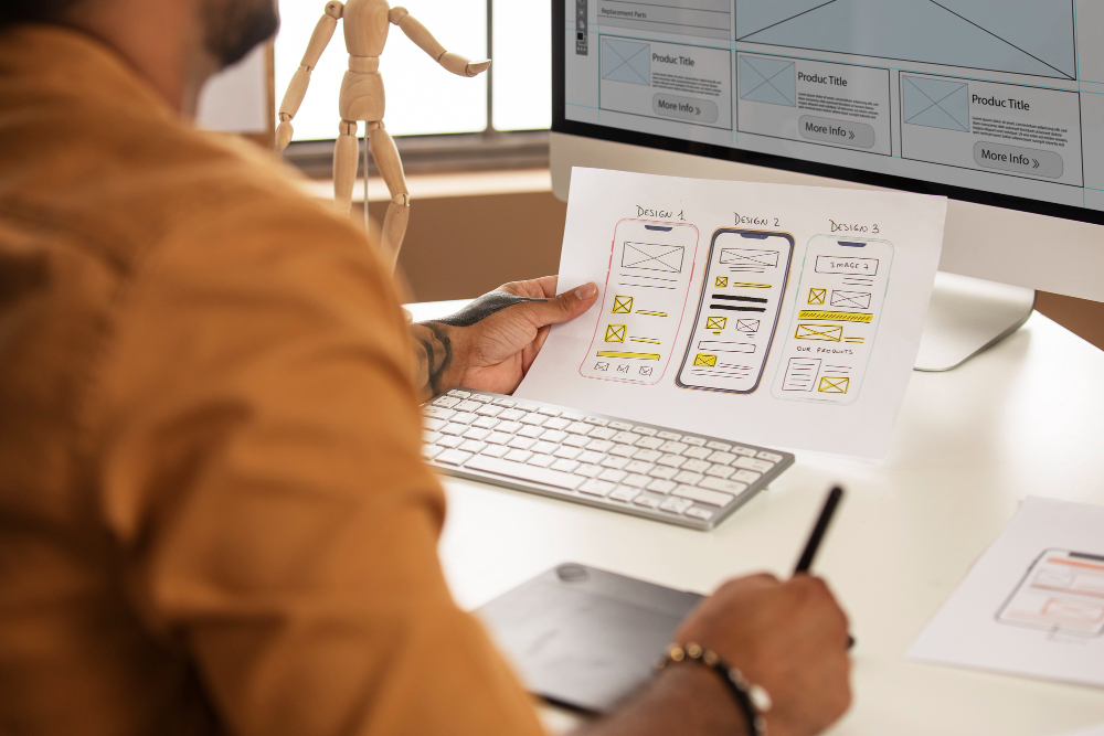
With mobile technologies gaining rapid popularity in the last few years, almost every new client these days wants a mobile version of their website. It’s practically essential after all:
one design for the iPhone, another for the iPad, many for the numerous Android phones and tablets, Blackberry, Kindle etc.— and all screen resolutions must be compatible, too. As the number of devices of different resolutions multiply, we’ll likely need to design for a number of additional inventions. When will the madness stop? It won’t, of course. We need to find a way around the madness. The way around is Responsive UI Design.
Responsive Web design is the approach that suggests that design and development should respond to the user’s behaviour and environment based on screen size, platform and orientation. The practice consists of a mix of flexible grids and layouts, images and an intelligent use of CSS media queries. CSS3 media queries, which include the browser width variable, are supported by most modern Web browsers
As the user switches from their laptop to Tablet to the SmartPhone, the website should automatically adjust to accommodate for resolution, image size and scripting abilities. This would eliminate the need for a different design and development phase for each new gadget on the market
With X-Value Technologies’ experience in HTML5/CSS3 technologies and a history of working on both the mobile and the web platforms, we are well placed to implement responsive UI Design